The yearlong shake down (a.k.a. search) for Amazon’s HQ2 has finally come to an end, and with a bit of a fizzle as Jeff Bezos, like Solomon, decided to split the baby. While it may have been a good thing had one of our target investment markets been selected, it bears mentioning that our target markets are already high growth areas by virtue of our selection criteria and therefore don’t need the boost from Amazon as much as some other markets may have.
As the holidays arrive, we have two acquisitions teed up to close, one disposition with a purchaser under contract, and one potential build-to-suit. More details on those activities below. It has been a busy year, although as we alluded to last quarter, it certainly seems like we must run faster to cover the same amount of ground. We will report the year-end total next quarter, but as it stands, we are on pace to have reviewed over 300 investment opportunities; however, the number of times we have made it to the final round of bidding for marketed deals or letter of intent negotiation for off-market deals will fall short of last year. And, while we will have to wait for the final tally and some end of year research, it appears that the number of offerings withdrawn from the market without transacting has risen as a proportion of the offerings we review. Perhaps that circumstance is a function of a widening divide between hopeful sellers and a rising level of caution amongst buyers. Although deals are getting done, as you will see in our commentary on commercial real estate (CRE) market conditions below.
Real Estate Market Conditions
At our weekly pipeline meetings, the team has observed at least anecdotally a general trend towards a widening of the bid/ask spread. Certainly not on every deal, but broadly speaking this trend had in our view been contributing to the general slowing of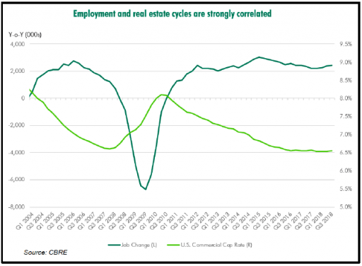 transaction volume evident in the statistics reported by various data services. Because we have commented in each recent quarter about declining transaction volume, it is incumbent upon us to report that the trend reversed markedly in Q3, driven largely by entity level transactions.Almost $30 billion of portfolioand entity level deals drove a 17% increase in Q3 transaction volume compared to Q3-2017. We had been attributing
the gradual volume declines to caution amongst investors, and even with the Q3 leap in volume that caution and price sensitivity was evident when analyzing deal volume by location. Total transaction activity in the six major metros grew at only 5% year over year; however, in the other markets volume was up 25% compared to Q3 last year.
We reported on CAP rates as well last quarter, and will likely continue to do so in an environment where interest rates and the shape of the yield curve are changing frequently. As a reminder, a few years ago we shared a study by CBRE which concluded that CAP rates are more correlated with the US unemployment rate than with interest rates. The evidence so far in this rising rate period would tend to support the conclusion of the CBRE study. Right on que, CBRE has update their analysis of this relationship between CAP rates and US employment, this time using changes in employment (gains or losses) so the correlation is inverse. The nearby chart shows the inverse correlation nicely. It must be noted that liquidity in the CRE markets has a significant impact on asset pricing, and overall financial market liquidity certainly has some correlation to economic conditions and employment, so it is hard to draw any conclusions around causality, but regardless, with job gains still strong each month the CBRE thesis should lead one to believe that CAP rates likely won’t move much. Of course sharply higher interest rates could choke off job growth. And as our readers have come to expect, we have some thoughts below on the direction of interest rates.
In spite of eight increases in the target range for the fed funds rate since late 2015, CAP rates were essentially flat to slightly down for some product types (multi-family) in Q3-2018. Of course, the previous paragraph notwithstanding, CAP rates are more sensitive to the longer end of the yield curve than the short, but CRE investors have been anticipating cap rate increases since the 10 year treasury (UST10) yield bottomed in 2016. Instead, as can be seen in the nearby chart on the next page, the spread between the UST10 and CAP rates for all product types has been compressing. If the recent peak UST10 of 3.25% was the high-water mark for long term rates, as we previously predicted it would be, then it may be some time before cap rates move up measurably.
Another reason CAP rates may not have risen much despite rising interest rates may be because of some modest compression of 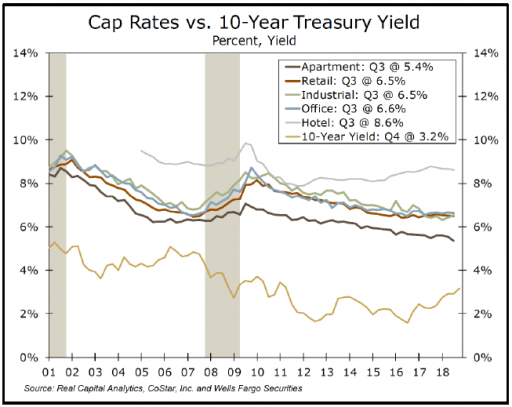 lender spreads and the loosening of loan terms allowing for more leverage. In August, Moody’s issued a statement securitized CRE loans (CMBS) are now “almost as risky as in 2007” because 75% of them are interest only, and the interest only period is now averaging almost 6 years, up from 2.2 years of interest only term just a few years that ago. In addition, these loans have become more “covenant light”, and the debt is being originated at higher leverage point in the property capital stack. Our view of CMBS is a bit less alarming. Based on discussions with actual lenders in the market, we concur that average interest only periods have lengthened, but the average is being driven by larger, high credit quality lower leveraged deals. In those cases, borrowers, mostly institutions, are essentially front loading their amortization, which allows slightly higher cash yield performance for their investments, a priority for their asset management modeling.
In addition to widely available debt for CRE, dry powder continues to be stockpiled on the equity side of the ledger as well. Research by PERE, a real estate private equity consulting firm, indicates almost $90 billion was raised by closed-ended real estate funds during the first nine months of 2018, the first time since 2015 that the market has experienced an increase in the capital raised in the Q1 to Q3 period. Fewer managers are raising more money resulting in consolidation of CRE capital and an increase in average fund sizes. PERE projects fundraising to reach about $125 billion by the end of 2018, a figure that would surpass the 2017 total of $119.5 billion.
Why is this steady increase of fund raising happening, especially if we are late in the cycle? According to Hodes Weill & Associates and Cornell University’s sixth annual Institutional Real Estate Allocations Monitor, the average target allocation to real estate by global institutional investors exceeded the 10% threshold for the first time ever in 2017, and has increased a further 30 basis points to 10.4% in 2018. Institutions are forecasting a further increase of 20 basis points by year end 2019.
Doug Weill, Managing Partner at Hodes Weill: “It is not clear how large allocations will grow, but we are starting to hear people talk about 15 to 20% for real estate and real assets combined.” Weill doesn’t think that will happen in the near term but it is firming up as a long-term goal. “I think we are going to see institutions with consistently double-digit plus allocations from here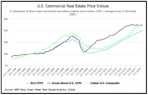 on in,” Weill says. Reasons given for increasing allocations include diversification, lower correlation to other asset classes, inflation hedging, and a combination of a good total return but also a reasonable cash yield, which is an increasingly important factor for institutions.
Given solid economic fundamentals, continued job growth and steady CAP rates, it is logical to expect CRE values to be stable to rising. In fact, they are both, depending on whose data you look at. We have ruminated before about the myriad sources of CRE data, how those sources frequently don’t agree, and how one must look at all or as many as possible of them to get a complete picture. The nearby chart is a perfect illustration. It shows a commercial property price index (CPPI) from three different sources. Our readers have seen indices from each of these sources at various times in the past. CoStar and RCA are services that we subscribe to, and in the case of CoStar pay exorbitant amounts of money to. Green Street is also a subscription service, but they publish their CPPI index for free. Each firm uses different methodologies for calculating their index. As can be seen in the chart, the three indices tell three different stories about CRE values. Green Street’s index, for which we did a deep dive in the Q1-2018 report, shows that values have been flat since peaking in September 2017. CoStar shows a pricing spike in 2016/2017, and then a flattening trend in 2018, and Real Capital Analytics shows a very steady linear rise from the trough during the recession all the way to the present. Our view is probably closest to CoStar’s, a steady rise from recessionary lows accelerating slightly in 2015/2016 followed by a relative flattening since. It could be because the CoStar index is proportionally more comprised of the types of properties we invest in. Remember, these are aggregates and therefore, somewhat misleading because prices in some product types, namely industrial and multi-family apartments, are significantly outperforming other sectors like retail which is actually down from its peak, and different markets are at different points in the value cycle at any given time. The important observations are the relative values, higher currently than previous cycle peak which should be expected if real estate is an inflation hedge, and the absence of any clear downward trend.
Macro-Economic Conditions
So what the heck is going on? Is inflation heating up? Recession imminent? Both? Our view, respectively, is: no, yes but when, and not likely. Of course, a recession will eventually come, perhaps soon if the Fed overshoots in raising interest rates. How likely the Fed is to overshoot depends on how the FOMC interprets the available inflation data trends and signals. An examination of those signals in a minute, but first a quick look at recession probabilities as they presently stand. Many analysts produce their own versions of recession indicating models. We highlighted one back in the Q1 report from this year which was the only one we knew of flashing yellow at the time. The one included herein has a pretty good track record and, while clearly showing trend lines falling from their peak, is a bit more sanguine about current conditions. It is produced by IMarket Signals (https://imarketsignals.com/bci/). Its model produces a series of metrics called the Business Cycle Index (BCI) to hypothetically 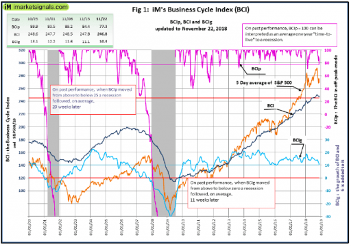 signal in advance the beginning of a recession. The BCI uses the UST10, the 3- month treasury bill yield (more on that spread below), the S&P500, continuing unemployment claims, total private employment, new houses for sale, and new houses sold. With apologies for the messiness of the chart, the BCI index is the black in the middle. As can be seen in the chart, the BCI index falls from its cycle peak before a recession in a smooth and well-defined manner. This “defined curve” is the basis for the alternative indicator BCIp, which is derived from the BCI and gives an average 20-week leading signal to the next recession when BCIp falls below 25. It is the purple line at the top of the chart and presently stands at 80, well above the red light waring level of 25. The BCIg, which uses a smoothed annualized growth rate, historically yields an average 11-week leading recession signal when it falls below zero. It is the blue line at the bottom, currently standing at 10, down from a cycle peak of 20. Bottom line, this series of indicators has a pretty good track record, and they do not at the moment indicate an imminent recession……..at least for 20+ weeks.
Additional good news, which has been widely reported in the press, is the fact that the number of job openings in the US exceeds the number of unemployed workers for the first time in two decades. Remarkable …., but one might ask why don’t the unemployed take the jobs that are open? Unfortunately, the better question is why don’t employers fill their open positions with the unemployed. 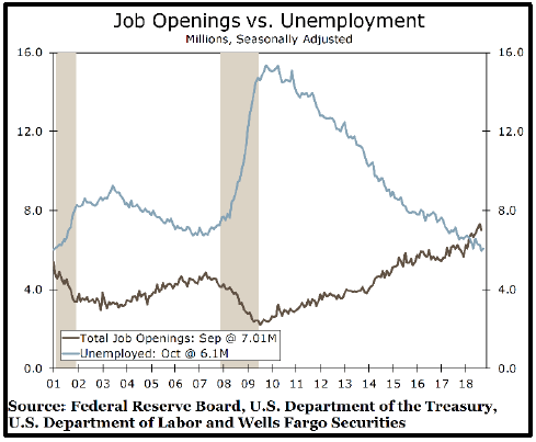 Unfortunately, the answer is in large part a significant skills gap brought on by changes in industry and technology, coupled with a lower propensity of workers to changes geographies. We will avoid a deep dive into the root causes of some of these problems in an effort to stay out of politics. Suffice it to say that the metric is an indication of a relatively tight labor market. Although, as we have argued recently, the labor market may not be as tight as some think.
If the labor market is tight, then we should be seeing more wage driven inflation. Yet inflation expectations, as measured by the TIPS (Treasury inflation protected securities), have been falling since spring. In April, the 5-year breakeven rate was indicating investors expected an average rate of inflation of around 2.16% over the next five years. Today, the market believes that average inflation rate will be 1.93%, down 23 basis points. We have seen a similar decline in the yield on the UST10 from its peak of 3.25%, tested twice in October and early November, to a current yield of 3.04%.
These declines in yield indicate the bond market appears for the moment to be less concerned about inflation than some of the Keynesian economists pontificating in the press and staffing the Fed. Indeed, the headline rate of inflation rate as measured by the year over year CPI, while rising slightly in October, has fallen over 30 basis points from the peak in the July reporting period. In two months, the headline rate of inflation has dropped from 2.89% to 2.53% as of October. While core inflation is decelerating, falling from 2.33% to 2.15% over the past three months, it remains above the targeted 2.0% figure watched by the Federal Reserve. Regardless of the clear evidence of falling inflation, the Federal Reserve is highly likely to follow through on its plan of raising rates in December.
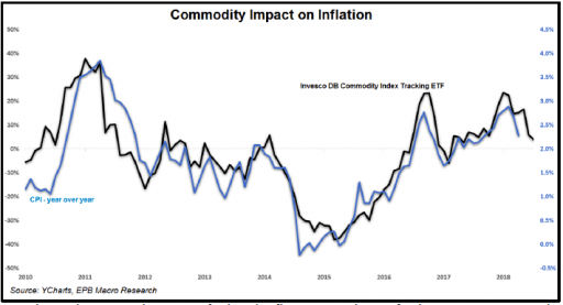 So where is inflation headed from here? Is this a temporary soft patch, or is peak inflation behind us? Last quarter and perhaps too often prior we have pointed out the correlation between the price of oil and inflation. Apologies for harping on it again, but this time with a twist. Correlation between the year over year growth rate in commodities as represented by the ETF us? quarter perhaps (DBC) and the headline inflation rate, with a two-month lag, is a relatively high .88. Marginal demand impacting commodity prices is driven largely by global economic growth. In this year’s Q1 report we remarked how the rising inflation at the time might be in large part a result of a late cycle surge in commodity prices. Well that trend has reversed and commodity prices have since turned down. The chart on the previous page shows that 2017 spike in a commodity tracking ETF and the accelerating headline inflation (CPI – year over year), as well as the reversal of both part way into 2018.
Interestingly, oil was one of the only commodities moving consistently higher over the past year, running counter to and somewhat propping up the rest of the commodity index since it turned down early this year. 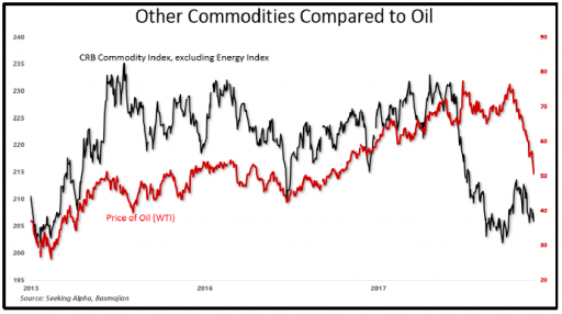 Now oil prices have converged with the rest of the commodity basket to the downside. See nearby chart. Oil is down almost 32% from its peak in early October. Talks of sanctions with Iran kept crude detached from the trending direction of most other related commodities until October. Then the bottom fell out, which was mostly a function of excess supply as the anticipated Iranian sanctions were softened and thus are having a lesser impact on supply. In addition, Saudi Arabia put more barrels on the market expecting tougher Iranian sanctions and the US continues in increase production to record levels. So with oil joining the rest of the commodity complex in decline, the probability of recent declines in inflation to reverse course and head north again should be slim.
Despite what may prove to be an inflection point for inflation, the Fed’s dot plot of expected Fed Funds rates still shows four more 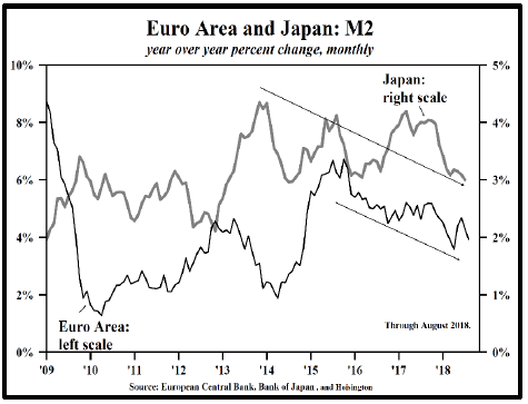 rate hikes through the end of 2019. The rhetoric in recent speeches by FOMC members has however moderated somewhat, giving markets hope that the dot plots might be behind the curve. Financial conditions are tightening around the world as liquidity slowly dries up. Take a look at the nearby chart from Hoisington on the money supply (M2) in the Euro Area and Japan. As discussed at greater length last quarter, Fed policy is a key determinant of worldwide dollar liquidity, and by removing dollar liquidity the Fed tightens financial conditions around the world, not just in the US. However, one good thing about the dramatic fall in oil prices recently is that it will ease liquidity constraints a bit on oil importing countries who will require less dollar denominated FX reserves held to secure and clear oil imports which transact in dollars. Members of the FOMC certainly know all of this and may be beginning to moderate their view of the need for significantly higher short term interest rates.
The flattening of the yield curve is also an indicator that gets a lot of attention. Official statements from Fed members including Chairman Powell generally downplay the significance of a yield curve inversion (short rates higher than long rates). In light of those statements it is curious to note that a group of San Francisco Fed economists conducted a study on various maturity spreads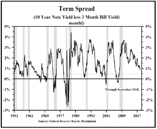 in the treasury market to measure the predictive qualities of the spreads across the yield curve. We are grateful to Hoisington for bringing this study to light. Using monthly data from January 1972 through July 2018, the SF Fed economists looked at each spread and predicted whether the economy would be in recession 12 months in the future. Their study found that the ten year vs. three month (UST10 minus T3m) spread was the “most reliable predictor” in signaling a
recession. An analysis of this spread since 1953 can be found in the nearby chart and is enlightening. Interestingly, this is the same spread used by the IMarket Signals Business Cycle Index we have highlighted above, and is one of the reasons we think the BCI index might be one of the better recession indicator models.
Economists and market prognosticators typically presume it is necessary for the yield curve to invert prior to recessions, primarily because all inversions have been followed by recessions. This chart reveals something different, namely, if UST10–T3m yield spread is still positive but falls below 40 bps (the dotted line on the chart), there is a more than reasonable possibility of a decline in economic activity. The spread is highly variable and as of this writing stands at 65 bps, close to the +40 bps level which would signal an outright recession on the horizon. One more 25 bps hike in the Federal Reserve target rate may be sufficient to move it to a full recession signal.
Overshooting by the Fed is a fairly gradual fashion in which to roll over into a recessionary environment. Are there any trigger events looming that might by more of a cliff dive, rather than a slow dance with time to adjust? One subject that has some analysts worried recently is the possibility that a large chunk of corporate debt residing in the lowest tier of investment grade (BBB) may fall below investment grade, forcing a destabilizing mass sale by institutional investors with restrictions limiting their holdings to investment grade only. There is approximately $3.1 trillion of this paper outstanding, up from only $760 million in 2007 going into the last recession. That is a massive increase, and unfortunately a large portion of that debt was used to buy back stock instead of investing in capital equipment to increase productive capacity. Essentially a corporate leveraging up occurred. Investment grade spreads, or the yield on investment-grade bonds above the yield on similar maturity Treasury bonds has increased from 1.2% to 1.6%, nearly the highest since 2016. While not alarming yet, it is something to watch, particularly given the magnitude of the debt outstanding. Quoting a macro analyst we follow, Eric Basmajian: “The issue with corporate debt spreads is that they work in a circular fashion; a feedback loop that ends in disaster. An economic slowdown widens corporate spreads, and wider corporate spreads exacerbate a slowdown, as Morgan Stanley notes (in a recent study on the impact of widening corporate spreads on GDP growth), leading to ever wider corporate spreads. Spreads have already widened by 40 basis points. Using Morgan Stanley’s analysis, if just this (40 bps) level of widening is sustained, 1.2% could come off GDP, lowering the year over year growth rate from 3.0% to 1.8%, which would be back to trend.”
The sovereign debt equivalent of the fear surrounding US corporate bonds falling in credit quality is Italian government debt, another possible cliff dive “trigger.” There is some appropriate anxiety about the fiscal conditions in Italy and its economic 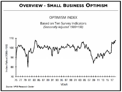 performance relative to the balance of the EU. Yields on Italian debt have already diverged from the rest of the large EU sovereigns, making a meaningful move higher. This bears watching. Ending on a positive note, small business optimism remains high, although slightly off its August peak, as reported by the NFIB. See nearby chart. Digging into the data shows some interesting patterns. “Plans to Hire” fell even as owners kept reporting inability to fill positions, which may indicate small business employers need to add staff but can’t find qualified workers in a relatively tight labor market. However, the survey also revealed no change in compensation plans, so small businesses appear to think higher wages won’t solve their hiring problems.
