What a ride the last year has been. We hope this finds you well and adjusting back into what we all wish to be a relatively new normal. We are a few days late getting our report out to you this quarter. The exigencies of preparing materials for the launch of our FOURTH fund offering later this month collided with the preparation of our quarterly reports on Fund II and Fund III. Please accept our apologies. We are very excited about the prospect of speaking to many of you regarding our new Fund IV very soon!
With the wide availability of multiple effective COVID vaccines in the U.S. returning economic conditions to s somewhat normal state since year-end 2020, we thought it best this quarter to share our perspective on the rapid turnaround of real estate investment capital since the depth of the pandemic in Q2-2020.
The Table of Contents below should assist our readers with navigating to a preferred section or getting a quick general quick take on our current thoughts.
What a different tune we are listening to today compared to 1Q-2020. As stated this time last year in our 1Q-2020 report we observed “…. several signs of a slowing economy before the pandemic, and what has occurred in the last two months has pushed us into choppy waters in the capital markets with impending recessionary macroeconomic environment.” As of 1Q-2021 the capital market environment has gone from choppy to a rising tide which is starting to make waves at the shoreline within two key sectors, namely industrial and multi-family, and the other major property sectors are a distant third…………offshore, but on the horizon. Further, a new Operating Real Estate class (“OpRe”) has emerged that includes Life Sciences, Single Family Rentals, Data Centers, Self-Storage, and Cold Storage. This new, although not actually new “class”, has witnessed a large up-tick in transaction volume, although the aggregate size of this OpRe class (both transaction amounts and collective physical size) is a fraction of the size of the four major food groups (office, industrial, retail and multi-family) …… more on that topic below.
Optimism is clearly back as property trades are occurring at much closer to normal volumes. The wall of institutional capital that was on the sidelines in late 2019 and through much of 2020 has begun to be deployed since early 3Q-2020. The capital invested has been primarily focused on “two and half sectors”, industrial and multi-family, as mentioned above, and the “half” is distressed hotels and the office sector. Investors with the fortitude to hit the “risk on” button for office and ground up industrial development (a preview of our Fund IV strategy) in late 2021 and through 2023 in our opinion will be winners over the next cycle. We believe those that took the “risk on” approach during the depths of the pandemic and those with the gumption to continue investing in the early innings of this “new normal” at somewhat discounted values will in the end generate above average risk adjusted returns.
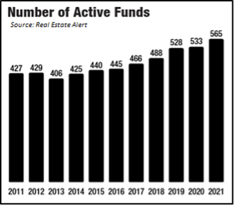 Over the last two years we witnessed unprecedent activity in the fundraising spheres. The two charts on this page and one on the next are all taken from the Real Estate Alert publication of March 2021 and present data on the global universe of private real estate investment funds like ours. In 4Q-2019, most observers thought the industry was reaching a cyclical peak at 528 currently active real estate focused funds, although as of 1Q-2021 the number has pushed even higher to 565 funds eclipsing the number of active funds since prior to the Global Financial Crisis (GFC). The number of real estate funds coupled with the amount of uninvested equity of over $240B (second nearby chart) represent a staggering amount of capital chasing higher yields in real estate.
There is no question the rise of real estate focused funds has led to commercial real estate becoming a sustainable investment class for institutional investors over the past two decades with many pension funds now allocating between 10% and 15% of their investment capital to CRE. The viability of CRE as an asset class has allowed large institutions the flexibility to efficiently liquidate and recycle CRE capital which provides these institutions the flexibility to allocate large percentages of their portfolio into commercial real estate.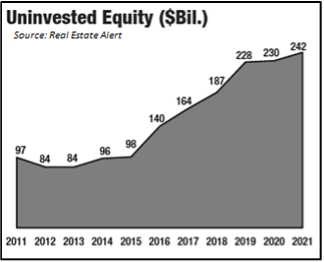
The massive growth we have witnessed in the size of the private real estate funds over the last decade has in turn driven up overall demand for properties and thus created highly competitive buyer pools. The competitive buyer pools have forced investment return expectations down (chart on the next page), and relatively cheap debt due to artificially depressed interest rates tends to drive asset values higher as well. When you couple this massive amount of capital raised alongside the major food groups of real estate that are liquid, the sector has set itself up for continued expansion. For example, immediately prior to the pandemic, record pricing had just occurred in several sectors which consequently required investors to underwrite lower projected returns. Accordingly, the expectations that real estate funds have been setting for their investors when raising capital have been steadily declining as can be seen in the nearby graph. Reading between the lines, fund managers have fallen short of finding sufficient opportunities to meet the lower expected returns, partially contributing to the rise of uninvested capital. The two graphs taken together are confirming what we observed over the last cycle, a stable amount of uninvested equity early in the recovery post GFC (2012 to 2015) coincided with relatively consistent return expectations in the 16% range. Then as pricing moved up and returns down, we saw the uninvested equity rise rapidly and return expectation fall by approximately 200 basis points. Now we are again seeing a flattening of uninvested equity amounts sitting mostly idle since 2019 and perhaps what appears to be early signs of stabilization for return expectations.
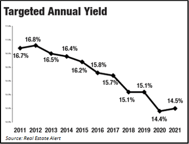 Investment history often repeats itself. Institutional investors will likely grow comfortable with the lower returns and continue committing capital to managers after the 2020 pause. As such, the uninvested equity will be deployed over the next five to seven years and likely translate into either stable cap rates or possibly continued cap rate compression. The imbalance between supply and demand for quality CRE investments continues, and real estate funds are being forced to consider their overall appetite and pricing thresholds for such risks. Clearly large CRE funds (greater than $100mm) per the graph above have made the leap to lower their expectations in order to deploy capital, perhaps in part because in most instances if they don’t invest the capital committed, they lose it!
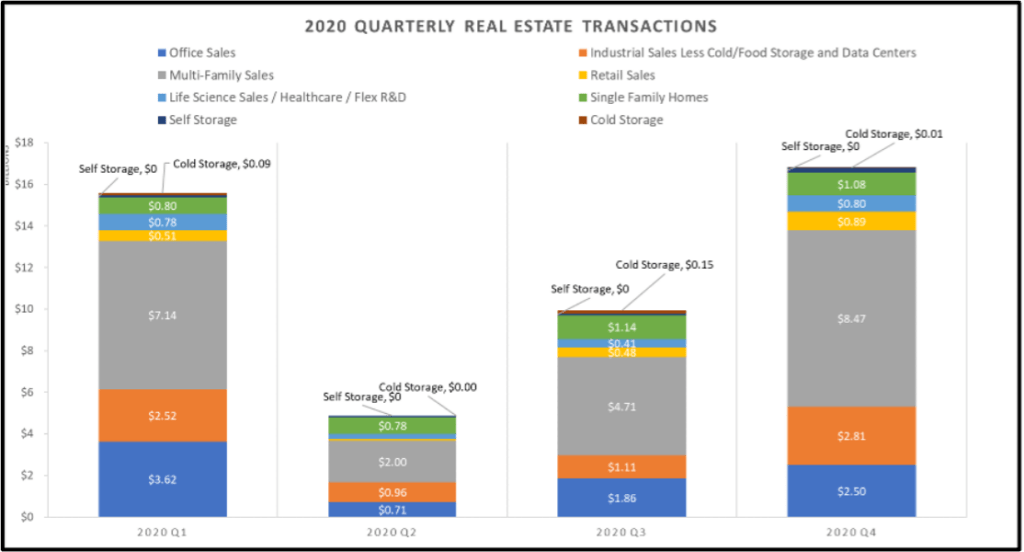
We took reviewing capital flows one step further to try and understand which CRE sectors saw the most activity within our ten target markets, and then we compared what occurred between 2019 and 2020. As mentioned in past quarters, we have a proprietary web-based platform, Griffin Essential or “GE” that allows us to track all the data we have compiled within each one of our target markets. We can slice and dice this data in numerous ways, and we can blend it with data from some of the industry sources we subscribe to. In the analysis below, the results were not surprising. However, the data do provide us with a clearer picture into what institutional investors gravitated towards to find yield both before and during the pandemic, and it may also signal where capital will flow as the economy fully reopens. In 2019 (see 2019 table on the next page) we tracked approximately $70.8 Billion in real estate transactions across all respective asset classes in our ten target markets. No surprise that in 2019 Office (28% of total), Industrial (14% of total) and Multi-family (44% of total) were where the lion’s share of the capital flowed.
In 2020 (see table nearby), overall transaction volume fell by almost half with approximately $47.1 Billion in transactions during 2020 across the respective asset classes in our target markets. Transaction volume within the four major food groups in 2020 was as follows: Office (18% of total), Industrial (16% of total) and Multi-family (47% of total). Office trades fell drastically from over $18.0 Billion in 2019 to less than $8.7 Billion in 2020, reflecting uncertainties over future demand and a dramatically wider bid-ask spread. Comparing 2019 to 2020 the number of trades came to a virtual crawl with over $17.0 Billion in 2Q-2019 compared to less than $4.9 Billion in 2Q-2020. This quick contraction in the capital markets was clearly due to the pandemic and no real surprise considering the immediate response from Sellers was to pull assets from the sale block, and most buyers pulled back on investing in the sector. Looking at the overall percentages in the four major food groups (Office, Industrial, Multi-family, Retail) these four sectors represented almost 90% of the total trades in the 2019 and over 85% in 2020. Digging a bit deeper, Industrial and Multi-family alone accounted for over 58% of the transaction volume in 2019 and the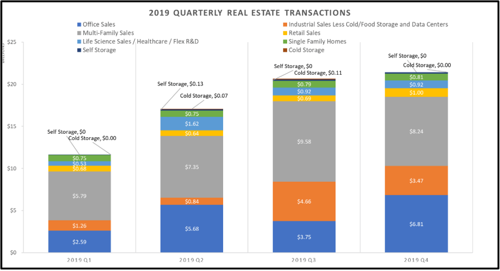 duo increased in 2020 to over 63% of the transactions. It was clear during the pandemic and through the latter half of 2020 institutional investors flocked to industrial and multi-family sectors for a safe harbor and yield having the most underwriting certainty.
Operating Real Estate - Interestingly what bubbled to the top in this comparison (although admittedly a bit hard to read in the tables herein) was this new “OpRe” class and the meaningful transaction volumes within this OpRe class. This OpRe class includes Life Sciences, Single Family Rentals, Data Centers, Self-Storage, and Cold Storage along with a few other things that are tiny and even harder to present in a table like production studios. In 2019, the OpRe class represented less than 11% of the transaction volume across our ten markets (just over $3.0 Billion), in 2020 that percentage increased (even during a global pandemic) by over 30%, to approximately 15% of the transaction volume across our ten target markets. This percent increase is staggering, but it is important to consider that the total amount of the physical OpRe product on the ground today is only a small fraction of the total real estate product available to trade. The total in-place value of the four major food groups dwarf this OpRe class, and in our opinion this OpRe class is not large enough to sustain continued inflow from large institutional investors at the 2020 pace we have observed. As such, at some point these investors will need to turn their attention back to Office and Retail as the pandemic and its effect on office and retail real estate subsides. (Shout out to Spencer Levy of CBRE for preaching this theme from the mountaintops.)
The largest OpRe class in 2020 by a wide margin was single family residential rental properties (SFR). Trade volume for Single Family Rentals across our ten target markets has increased by almost a $1.0 Billion
between 2019 and 2020, during a global pandemic. We find the surge of investment in SFR and other OpRe asset classes a very interesting indication of the length to which institutional capital is willing to push to find yield in this environment. There is additional operational risk in these assets which is not as fully present in the larger, more traditional assets classes. The risk can be underwritten, but one would expect at least a small premium for the additional risk; however, these assets are often trading at cap rates lower than the yields available in the larger asset classes as capital crowds into a relatively small space.
Curious.
Inflation is rising, as everyone expected. The government’s April inflation statistics were in a few measurements the highest since the very early 1980’s, garnering extensive headlines. Some components of the April stats can clearly be traced to temporary supply constraints, many of which are well documented, and as such don’t warrant being listed here. The Federal Reserve is holding steadfast to a narrative which states any inflation will be transitory. We have not changed our opinion, laid out in last quarter’s report, which agrees with the Fed, albeit for different reasons…or at least reasons the Fed prefers not to acknowledge. So, after a period of elevated inflation, we anticipate a return to slower growth, most likely in a range on average below the low growth rate of the last expansion.
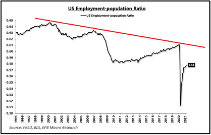 Last quarter we highlighted low population growth as an impediment to higher economic growth and therefore higher inflation, but another very important condition is required for sustained inflation. The employment to population ratio must be at least stable and more likely rising to maintain elevated levels of inflation. EPB Macro Research points out that the inflation of the 1970s “came with significantly higher real economic growth, a positive output gap relative to trend potential, lower levels of starting debt, positive net national savings, and radically different demographics.” More importantly EPB continues “the 1970s saw a major shift in the demand curve through a rapid increase in the employment to population ratio. The employment to population rate is roughly at the same level today as it was to start the 1970s inflation, but the path was sharply higher for the next 10 years while the expected path is lower today.” The nearby chart of the US employment to population ratio shows the peak in 2000 of around 64%, followed by a clear trend of decline with successive peaks and troughs lower in each cycle than the previous cycle. The demographic trend of an aging population suggests the U.S will continue to experience a lower employment to population ratio as opposed to the rising one experienced in the 1970s.
But WHY is the employment to population ratio low and declining? By now everyone is familiar with the complaints of employers unable to find employees as substantial fiscal support is holding many people out of the labor force. A cynic would say U.S. government policy is achieving an increase in the national minimum wage through the back door by keeping lower wage potential employees at home on the couch, or at the beach since summer is almost here! Regardless, it is undeniable that policy changes are at least at present raising the cost of labor. But surely that is a temporary condition since the excess federal benefits expire in September, right? Maybe not. An examination of the proportion of personal income in the U.S. derived from government transfer payments over the past six decades shows a clear pattern of successive permanent increases in the level of transfer payments.
An increase in permanent portion of transfer payments as a component of personal income does not bode well for long term growth because among other things it will put downward pressure on the employment to population ratio. It also adds a second risk to the reserve currency status of the U.S. by squeezing out defense spending (a subject we might explore in a future writing). The chart nearby shows the ratio of transfer receipts as a percentage of total personal income. Total personal income includes wages, interest, dividends, rental income, social security, and other items. In the 1960s at the dawn of LBJ’s Great Society, the government (federal and state) was responsible for providing about 5% of total personal income. The sustained “permanent” level has risen three times since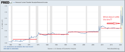 then. First dramatically more than doubling to around 12% in the mid 1970s then remaining relatively stable through 1990 (Ford/Carter/Regan/Bush 41), then again to just under 15% in the 1990s through the GFC (Clinton/Bush 43), and then again to approximately 17% after the GFC to the present (Obama/Trump). Note each order of magnitude increase is in response to a recession, but then recessionary support is not withdrawn. With the current huge stimulus payments and excess unemployment benefits deployed in response to the COVID recession, the ratio has increased to nearly 35%!! Obviously, the ratio cannot stay at 35%, but we are very likely in the process (politically) of determining a new post-COVID level of transfer payments. The new ratio will probably be higher than the pre-COVID standard of ~17%. If the existing trend persists, we may decide to set a new level of government income transfer payments well north of 20% of total income.
In March, the Wall Street Journal published an editorial by Phil Gramm and John Early summarizing some research they conducted exploring among other things the impact of taxes and transfer payments on income inequality. Interestingly, the standard measure of income inequality, the Gini Coefficient, is fairly stable in the U.S. after taking into account taxes and transfer payments. The black line in the nearby chart. This finding runs counter to the widely purported narrative of large and accelerating income inequality in the U.S. More relevant to our discussion of the U.S. labor market, Gramm and Early say: “As government transfer payments to low-income households exploded, their labor-force participation collapsed and the percentage of income in the bottom quintile coming from government payments rose above 90%.” That is NINE ZERO %! 20% of the U.S. population is getting 90% of its income from the government. Gramm and Early go on to conclude: “A major force behind the pre-tax and pre-transfer [bad Gini]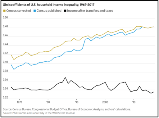 numbers is the fall in labor force participation among people experiencing low income. It is not entirely impossible that some causality runs from larger means-tested benefits -- earn a dollar lose a dollar worth of benefits -- to withdrawing from the workforce, rather than the other way around.” Hmmm, seems sort of logical. We try to remain as apolitical as possible, but this appears to be an example of well-intentioned government policy applied to a highly complex system resulting in unintended consequences that run counter to the objectives of the policy.
There is also a difference between income inequality, which the nearby graph illustrates, and wealth inequality. There can be no question that the broad twin policies of suppressing labor market participation and interest rate suppression (hyper easy money) significantly exacerbate wealth inequality. Fewer jobs, less earned income and less opportunity for advancement alongside higher asset values benefitting the already wealthy who own most of the assets. Recently, the famous and highly successful investor (asset owner), billionaire Stan Druckenmiller, has been making the media rounds pointing out that the policies of the Fed since the GFC have been the primary cause of inequality in the U.S. Druckenmiller: “I don’t think there has been a greater engine of inequality than the Federal Reserve Bank of the United States”.
In addition to the long-term damage from manipulating the most important price in the economy, the cost of money, by artificially suppressing interest rates, the Fed views inflation through the lens of statistical measures which understate the cost of things comprising a larger portion of the spending of the fourth and fifth income quintiles, especially housing and health care. Lastly on this subject, the war on fossil fuels is inflationary. This proposition is inarguable in the short and intermediate term. The cost of energy is imbedded in the cost of almost all goods and services we consume. Growing, harvesting and moving food is energy-intensive. Mining industrial metals, including the materials critical to “green” energy, and processing them into manufacturing inputs is very energy-intensive. Therefore, a persistent higher price for energy is likely to have a material impact on the cost of all goods and services.
It is possible that the technologies, materials and installed infrastructure will ultimately make ultra large scale renewable energy less expensive than our current system which relies on fossil fuels for a majority of our energy, but that hoped-for future is not the present condition. Inflation indices do accurately track energy inflation; however, Fed (and other) policy makers often ignore it by stripping out energy and food to arrive at a “core” measure of inflation. That is fine as long as you are not standing at the pump! As we have pointed out probably too often in the past, including featuring it in last quarter’s report, we believe there is a significant link between the price of oil and past bouts of sustained inflation. Apolitical? Yes, just the facts ma’am. Talking our book? Probably.
So, should we be concerned about current policies imbedding into the economy the elements of stagflation, namely lower future growth rates because of huge amounts of additional debt while simultaneously raising the cost of labor and energy? While cycles of economic growth and cycles of inflation cycles are frequently correlated, they have independent elements pushing and constraining them which can result in periods of noncorrelation. There are multiple occasions in U.S. economic history (especially predating the birth of the Fed in 1913, hmmm….) where rapid economic growth was accompanied by disinflation or even deflation. These periods often occurred at times of meaningful technological advancement and high levels of investment. Notably, we also know of a period in the 1970s where relatively slow growth and high unemployment were accompanied by very high inflation. It is that period which gave rise to the term “stagflation.”
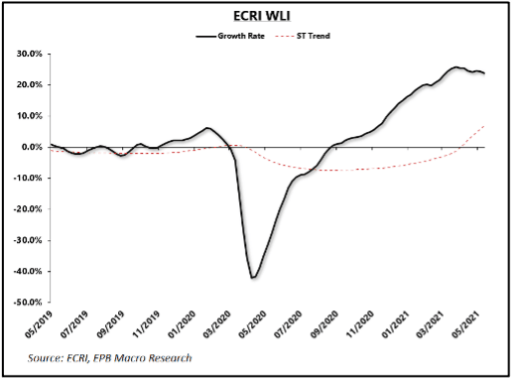 As articulated last quarter, we believe that the 1970s were an aberration, resulting from conditions that do not exist today. At that time, the economy was absorbing huge secular impacts. First the dawn of the age of fiat currency after abandoning the gold standard, and then two massive oil price shocks raising energy costs multiple orders of magnitude. The shift from fossil fuels to renewables will raise energy costs, but very likely at a much slower rate than the 1970s. While we may be in the middle of a reset to higher wages especially at the lower end of the earnings scale, we believe an eventual return to trend secular GDP growth rate of around 1.5% will keep longer term wage growth in a subdued trend just as it has been for the past two cycles. When will the economy return to the slow growth trend? There are lots of opinions on that subject, but our guess is a few quarters out from now, maybe Q1-2022. The ECRI Weekly Leading Index we have highlighted in the past (most recently Q4-2020 page 11) peaked at the end of March. See nearby chart. Red hot commodities, notably lumber, have also retreated from recent highs. While it is certainly too early to declare an inflection point, especially from observing only one index and a few commodities, we can infer that the torrid pace of the rebound expansion has at least paused for the moment. A circumstance that will lessen inflationary pressures. Also, despite net negative national savings because of massive government deficits, investment in core capital goods has picked up markedly (nearby chart), likely in response to bottlenecks and post COVID adjustments to the manufacturing and supply chains. Expansion of capacity is also a headwind for inflation.
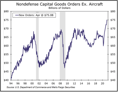
Real interest rates, as measured by inflation protected US treasuries (TIPS), have been trending slightly down since the end of February, and the 10-year treasury bond (UST10) has been range bound for several months around 1.65%. Accordingly, the bond market seems to have taken the hot April inflation numbers in stride. The long end of the yield curve has been relatively stable since the move up early in the year and recently has shown signs of moving to a lower sustained level, indicating the market agrees with the Fed regarding the transitory nature of inflation and thinks growth will eventually return to its secular lows of the past cycle. The Fed of course keeps the short end of the curve locked tight at zero (7 bps in its latest quarterly report). However, it is in the middle part of the yield curve where things might get interesting. Five and seven year rates have been moving up slightly of late, indicating that the market and the Fed do not concur on the time portion of the definition of “transitory.” The market thinks things will get a little hotter a little sooner than the Fed does. Probably not a reconstitution of the bond vigilantes, but setting up to be an interesting skirmish nonetheless…..
With the wide availability of multiple effective COVID vaccines in the U.S. returning economic conditions to s somewhat normal state since year-end 2020, we thought it best this quarter to share our perspective on the rapid turnaround of real estate investment capital since the depth of the pandemic in Q2-2020.
The Table of Contents below should assist our readers with navigating to a preferred section or getting a quick general quick take on our current thoughts.
- Real Estate Market Conditions: Pages 1-3. In this section the TEAM will summarize real estate capital flows in 2020 and the anticipated rebound that is in the early innings as of H1-2021.
- On Page 4, we will also touch upon this “new” Operating Real Estate class (“OpRe”) that various investors are pursuing due to the pandemic as they diversify away from the traditional four major food groups of commercial real estate (CRE).
- Macro-Economic Conditions: Page 6. In this section will assess Inflation and the Labor Market – Inflation running hot and labor tight, but how long will it last?
- Stagflation – Page 8 – Should we be worried? Probably not.
Real Estate Market Conditions
What a different tune we are listening to today compared to 1Q-2020. As stated this time last year in our 1Q-2020 report we observed “…. several signs of a slowing economy before the pandemic, and what has occurred in the last two months has pushed us into choppy waters in the capital markets with impending recessionary macroeconomic environment.” As of 1Q-2021 the capital market environment has gone from choppy to a rising tide which is starting to make waves at the shoreline within two key sectors, namely industrial and multi-family, and the other major property sectors are a distant third…………offshore, but on the horizon. Further, a new Operating Real Estate class (“OpRe”) has emerged that includes Life Sciences, Single Family Rentals, Data Centers, Self-Storage, and Cold Storage. This new, although not actually new “class”, has witnessed a large up-tick in transaction volume, although the aggregate size of this OpRe class (both transaction amounts and collective physical size) is a fraction of the size of the four major food groups (office, industrial, retail and multi-family) …… more on that topic below.
Optimism is clearly back as property trades are occurring at much closer to normal volumes. The wall of institutional capital that was on the sidelines in late 2019 and through much of 2020 has begun to be deployed since early 3Q-2020. The capital invested has been primarily focused on “two and half sectors”, industrial and multi-family, as mentioned above, and the “half” is distressed hotels and the office sector. Investors with the fortitude to hit the “risk on” button for office and ground up industrial development (a preview of our Fund IV strategy) in late 2021 and through 2023 in our opinion will be winners over the next cycle. We believe those that took the “risk on” approach during the depths of the pandemic and those with the gumption to continue investing in the early innings of this “new normal” at somewhat discounted values will in the end generate above average risk adjusted returns.
Over the last two years we witnessed unprecedent activity in the fundraising spheres. The two charts on this page and one on the next are all taken from the Real Estate Alert publication of March 2021 and present data on the global universe of private real estate investment funds like ours. In 4Q-2019, most observers thought the industry was reaching a cyclical peak at 528 currently active real estate focused funds, although as of 1Q-2021 the number has pushed even higher to 565 funds eclipsing the number of active funds since prior to the Global Financial Crisis (GFC). The number of real estate funds coupled with the amount of uninvested equity of over $240B (second nearby chart) represent a staggering amount of capital chasing higher yields in real estate.There is no question the rise of real estate focused funds has led to commercial real estate becoming a sustainable investment class for institutional investors over the past two decades with many pension funds now allocating between 10% and 15% of their investment capital to CRE. The viability of CRE as an asset class has allowed large institutions the flexibility to efficiently liquidate and recycle CRE capital which provides these institutions the flexibility to allocate large percentages of their portfolio into commercial real estate.
The massive growth we have witnessed in the size of the private real estate funds over the last decade has in turn driven up overall demand for properties and thus created highly competitive buyer pools. The competitive buyer pools have forced investment return expectations down (chart on the next page), and relatively cheap debt due to artificially depressed interest rates tends to drive asset values higher as well. When you couple this massive amount of capital raised alongside the major food groups of real estate that are liquid, the sector has set itself up for continued expansion. For example, immediately prior to the pandemic, record pricing had just occurred in several sectors which consequently required investors to underwrite lower projected returns. Accordingly, the expectations that real estate funds have been setting for their investors when raising capital have been steadily declining as can be seen in the nearby graph. Reading between the lines, fund managers have fallen short of finding sufficient opportunities to meet the lower expected returns, partially contributing to the rise of uninvested capital. The two graphs taken together are confirming what we observed over the last cycle, a stable amount of uninvested equity early in the recovery post GFC (2012 to 2015) coincided with relatively consistent return expectations in the 16% range. Then as pricing moved up and returns down, we saw the uninvested equity rise rapidly and return expectation fall by approximately 200 basis points. Now we are again seeing a flattening of uninvested equity amounts sitting mostly idle since 2019 and perhaps what appears to be early signs of stabilization for return expectations.
Investment history often repeats itself. Institutional investors will likely grow comfortable with the lower returns and continue committing capital to managers after the 2020 pause. As such, the uninvested equity will be deployed over the next five to seven years and likely translate into either stable cap rates or possibly continued cap rate compression. The imbalance between supply and demand for quality CRE investments continues, and real estate funds are being forced to consider their overall appetite and pricing thresholds for such risks. Clearly large CRE funds (greater than $100mm) per the graph above have made the leap to lower their expectations in order to deploy capital, perhaps in part because in most instances if they don’t invest the capital committed, they lose it!We took reviewing capital flows one step further to try and understand which CRE sectors saw the most activity within our ten target markets, and then we compared what occurred between 2019 and 2020. As mentioned in past quarters, we have a proprietary web-based platform, Griffin Essential or “GE” that allows us to track all the data we have compiled within each one of our target markets. We can slice and dice this data in numerous ways, and we can blend it with data from some of the industry sources we subscribe to. In the analysis below, the results were not surprising. However, the data do provide us with a clearer picture into what institutional investors gravitated towards to find yield both before and during the pandemic, and it may also signal where capital will flow as the economy fully reopens. In 2019 (see 2019 table on the next page) we tracked approximately $70.8 Billion in real estate transactions across all respective asset classes in our ten target markets. No surprise that in 2019 Office (28% of total), Industrial (14% of total) and Multi-family (44% of total) were where the lion’s share of the capital flowed.
In 2020 (see table nearby), overall transaction volume fell by almost half with approximately $47.1 Billion in transactions during 2020 across the respective asset classes in our target markets. Transaction volume within the four major food groups in 2020 was as follows: Office (18% of total), Industrial (16% of total) and Multi-family (47% of total). Office trades fell drastically from over $18.0 Billion in 2019 to less than $8.7 Billion in 2020, reflecting uncertainties over future demand and a dramatically wider bid-ask spread. Comparing 2019 to 2020 the number of trades came to a virtual crawl with over $17.0 Billion in 2Q-2019 compared to less than $4.9 Billion in 2Q-2020. This quick contraction in the capital markets was clearly due to the pandemic and no real surprise considering the immediate response from Sellers was to pull assets from the sale block, and most buyers pulled back on investing in the sector. Looking at the overall percentages in the four major food groups (Office, Industrial, Multi-family, Retail) these four sectors represented almost 90% of the total trades in the 2019 and over 85% in 2020. Digging a bit deeper, Industrial and Multi-family alone accounted for over 58% of the transaction volume in 2019 and the
duo increased in 2020 to over 63% of the transactions. It was clear during the pandemic and through the latter half of 2020 institutional investors flocked to industrial and multi-family sectors for a safe harbor and yield having the most underwriting certainty.Operating Real Estate - Interestingly what bubbled to the top in this comparison (although admittedly a bit hard to read in the tables herein) was this new “OpRe” class and the meaningful transaction volumes within this OpRe class. This OpRe class includes Life Sciences, Single Family Rentals, Data Centers, Self-Storage, and Cold Storage along with a few other things that are tiny and even harder to present in a table like production studios. In 2019, the OpRe class represented less than 11% of the transaction volume across our ten markets (just over $3.0 Billion), in 2020 that percentage increased (even during a global pandemic) by over 30%, to approximately 15% of the transaction volume across our ten target markets. This percent increase is staggering, but it is important to consider that the total amount of the physical OpRe product on the ground today is only a small fraction of the total real estate product available to trade. The total in-place value of the four major food groups dwarf this OpRe class, and in our opinion this OpRe class is not large enough to sustain continued inflow from large institutional investors at the 2020 pace we have observed. As such, at some point these investors will need to turn their attention back to Office and Retail as the pandemic and its effect on office and retail real estate subsides. (Shout out to Spencer Levy of CBRE for preaching this theme from the mountaintops.)
The largest OpRe class in 2020 by a wide margin was single family residential rental properties (SFR). Trade volume for Single Family Rentals across our ten target markets has increased by almost a $1.0 Billion
between 2019 and 2020, during a global pandemic. We find the surge of investment in SFR and other OpRe asset classes a very interesting indication of the length to which institutional capital is willing to push to find yield in this environment. There is additional operational risk in these assets which is not as fully present in the larger, more traditional assets classes. The risk can be underwritten, but one would expect at least a small premium for the additional risk; however, these assets are often trading at cap rates lower than the yields available in the larger asset classes as capital crowds into a relatively small space.
Curious.
Macro-Economic Conditions
Inflation and the Labor Market
Inflation is rising, as everyone expected. The government’s April inflation statistics were in a few measurements the highest since the very early 1980’s, garnering extensive headlines. Some components of the April stats can clearly be traced to temporary supply constraints, many of which are well documented, and as such don’t warrant being listed here. The Federal Reserve is holding steadfast to a narrative which states any inflation will be transitory. We have not changed our opinion, laid out in last quarter’s report, which agrees with the Fed, albeit for different reasons…or at least reasons the Fed prefers not to acknowledge. So, after a period of elevated inflation, we anticipate a return to slower growth, most likely in a range on average below the low growth rate of the last expansion.
Last quarter we highlighted low population growth as an impediment to higher economic growth and therefore higher inflation, but another very important condition is required for sustained inflation. The employment to population ratio must be at least stable and more likely rising to maintain elevated levels of inflation. EPB Macro Research points out that the inflation of the 1970s “came with significantly higher real economic growth, a positive output gap relative to trend potential, lower levels of starting debt, positive net national savings, and radically different demographics.” More importantly EPB continues “the 1970s saw a major shift in the demand curve through a rapid increase in the employment to population ratio. The employment to population rate is roughly at the same level today as it was to start the 1970s inflation, but the path was sharply higher for the next 10 years while the expected path is lower today.” The nearby chart of the US employment to population ratio shows the peak in 2000 of around 64%, followed by a clear trend of decline with successive peaks and troughs lower in each cycle than the previous cycle. The demographic trend of an aging population suggests the U.S will continue to experience a lower employment to population ratio as opposed to the rising one experienced in the 1970s.But WHY is the employment to population ratio low and declining? By now everyone is familiar with the complaints of employers unable to find employees as substantial fiscal support is holding many people out of the labor force. A cynic would say U.S. government policy is achieving an increase in the national minimum wage through the back door by keeping lower wage potential employees at home on the couch, or at the beach since summer is almost here! Regardless, it is undeniable that policy changes are at least at present raising the cost of labor. But surely that is a temporary condition since the excess federal benefits expire in September, right? Maybe not. An examination of the proportion of personal income in the U.S. derived from government transfer payments over the past six decades shows a clear pattern of successive permanent increases in the level of transfer payments.
An increase in permanent portion of transfer payments as a component of personal income does not bode well for long term growth because among other things it will put downward pressure on the employment to population ratio. It also adds a second risk to the reserve currency status of the U.S. by squeezing out defense spending (a subject we might explore in a future writing). The chart nearby shows the ratio of transfer receipts as a percentage of total personal income. Total personal income includes wages, interest, dividends, rental income, social security, and other items. In the 1960s at the dawn of LBJ’s Great Society, the government (federal and state) was responsible for providing about 5% of total personal income. The sustained “permanent” level has risen three times since
then. First dramatically more than doubling to around 12% in the mid 1970s then remaining relatively stable through 1990 (Ford/Carter/Regan/Bush 41), then again to just under 15% in the 1990s through the GFC (Clinton/Bush 43), and then again to approximately 17% after the GFC to the present (Obama/Trump). Note each order of magnitude increase is in response to a recession, but then recessionary support is not withdrawn. With the current huge stimulus payments and excess unemployment benefits deployed in response to the COVID recession, the ratio has increased to nearly 35%!! Obviously, the ratio cannot stay at 35%, but we are very likely in the process (politically) of determining a new post-COVID level of transfer payments. The new ratio will probably be higher than the pre-COVID standard of ~17%. If the existing trend persists, we may decide to set a new level of government income transfer payments well north of 20% of total income.In March, the Wall Street Journal published an editorial by Phil Gramm and John Early summarizing some research they conducted exploring among other things the impact of taxes and transfer payments on income inequality. Interestingly, the standard measure of income inequality, the Gini Coefficient, is fairly stable in the U.S. after taking into account taxes and transfer payments. The black line in the nearby chart. This finding runs counter to the widely purported narrative of large and accelerating income inequality in the U.S. More relevant to our discussion of the U.S. labor market, Gramm and Early say: “As government transfer payments to low-income households exploded, their labor-force participation collapsed and the percentage of income in the bottom quintile coming from government payments rose above 90%.” That is NINE ZERO %! 20% of the U.S. population is getting 90% of its income from the government. Gramm and Early go on to conclude: “A major force behind the pre-tax and pre-transfer [bad Gini]
numbers is the fall in labor force participation among people experiencing low income. It is not entirely impossible that some causality runs from larger means-tested benefits -- earn a dollar lose a dollar worth of benefits -- to withdrawing from the workforce, rather than the other way around.” Hmmm, seems sort of logical. We try to remain as apolitical as possible, but this appears to be an example of well-intentioned government policy applied to a highly complex system resulting in unintended consequences that run counter to the objectives of the policy.There is also a difference between income inequality, which the nearby graph illustrates, and wealth inequality. There can be no question that the broad twin policies of suppressing labor market participation and interest rate suppression (hyper easy money) significantly exacerbate wealth inequality. Fewer jobs, less earned income and less opportunity for advancement alongside higher asset values benefitting the already wealthy who own most of the assets. Recently, the famous and highly successful investor (asset owner), billionaire Stan Druckenmiller, has been making the media rounds pointing out that the policies of the Fed since the GFC have been the primary cause of inequality in the U.S. Druckenmiller: “I don’t think there has been a greater engine of inequality than the Federal Reserve Bank of the United States”.
In addition to the long-term damage from manipulating the most important price in the economy, the cost of money, by artificially suppressing interest rates, the Fed views inflation through the lens of statistical measures which understate the cost of things comprising a larger portion of the spending of the fourth and fifth income quintiles, especially housing and health care. Lastly on this subject, the war on fossil fuels is inflationary. This proposition is inarguable in the short and intermediate term. The cost of energy is imbedded in the cost of almost all goods and services we consume. Growing, harvesting and moving food is energy-intensive. Mining industrial metals, including the materials critical to “green” energy, and processing them into manufacturing inputs is very energy-intensive. Therefore, a persistent higher price for energy is likely to have a material impact on the cost of all goods and services.
It is possible that the technologies, materials and installed infrastructure will ultimately make ultra large scale renewable energy less expensive than our current system which relies on fossil fuels for a majority of our energy, but that hoped-for future is not the present condition. Inflation indices do accurately track energy inflation; however, Fed (and other) policy makers often ignore it by stripping out energy and food to arrive at a “core” measure of inflation. That is fine as long as you are not standing at the pump! As we have pointed out probably too often in the past, including featuring it in last quarter’s report, we believe there is a significant link between the price of oil and past bouts of sustained inflation. Apolitical? Yes, just the facts ma’am. Talking our book? Probably.
Stagflation?
So, should we be concerned about current policies imbedding into the economy the elements of stagflation, namely lower future growth rates because of huge amounts of additional debt while simultaneously raising the cost of labor and energy? While cycles of economic growth and cycles of inflation cycles are frequently correlated, they have independent elements pushing and constraining them which can result in periods of noncorrelation. There are multiple occasions in U.S. economic history (especially predating the birth of the Fed in 1913, hmmm….) where rapid economic growth was accompanied by disinflation or even deflation. These periods often occurred at times of meaningful technological advancement and high levels of investment. Notably, we also know of a period in the 1970s where relatively slow growth and high unemployment were accompanied by very high inflation. It is that period which gave rise to the term “stagflation.”
As articulated last quarter, we believe that the 1970s were an aberration, resulting from conditions that do not exist today. At that time, the economy was absorbing huge secular impacts. First the dawn of the age of fiat currency after abandoning the gold standard, and then two massive oil price shocks raising energy costs multiple orders of magnitude. The shift from fossil fuels to renewables will raise energy costs, but very likely at a much slower rate than the 1970s. While we may be in the middle of a reset to higher wages especially at the lower end of the earnings scale, we believe an eventual return to trend secular GDP growth rate of around 1.5% will keep longer term wage growth in a subdued trend just as it has been for the past two cycles. When will the economy return to the slow growth trend? There are lots of opinions on that subject, but our guess is a few quarters out from now, maybe Q1-2022. The ECRI Weekly Leading Index we have highlighted in the past (most recently Q4-2020 page 11) peaked at the end of March. See nearby chart. Red hot commodities, notably lumber, have also retreated from recent highs. While it is certainly too early to declare an inflection point, especially from observing only one index and a few commodities, we can infer that the torrid pace of the rebound expansion has at least paused for the moment. A circumstance that will lessen inflationary pressures. Also, despite net negative national savings because of massive government deficits, investment in core capital goods has picked up markedly (nearby chart), likely in response to bottlenecks and post COVID adjustments to the manufacturing and supply chains. Expansion of capacity is also a headwind for inflation.Interest Rates
Real interest rates, as measured by inflation protected US treasuries (TIPS), have been trending slightly down since the end of February, and the 10-year treasury bond (UST10) has been range bound for several months around 1.65%. Accordingly, the bond market seems to have taken the hot April inflation numbers in stride. The long end of the yield curve has been relatively stable since the move up early in the year and recently has shown signs of moving to a lower sustained level, indicating the market agrees with the Fed regarding the transitory nature of inflation and thinks growth will eventually return to its secular lows of the past cycle. The Fed of course keeps the short end of the curve locked tight at zero (7 bps in its latest quarterly report). However, it is in the middle part of the yield curve where things might get interesting. Five and seven year rates have been moving up slightly of late, indicating that the market and the Fed do not concur on the time portion of the definition of “transitory.” The market thinks things will get a little hotter a little sooner than the Fed does. Probably not a reconstitution of the bond vigilantes, but setting up to be an interesting skirmish nonetheless…..