As mentioned last quarter, with the benefit of some time and thoughtful perspective, we are able to reflect on Hurricane Harvey and its impact on the Houston area. The storm certainly left its mark, although initial fears regarding the magnitude of damage were overstated, as is often the case in our hyper charged media environment. First the hard facts, then a few sentiments. Data about the impact on housing, commercial properties, vehicles, etc. 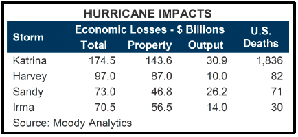 are estimates that evolve and become more accurate over time. For example, the nearby table ranking Harvey with prior major storms shows Moody Analytics’ revised estimates made in October. Total damage was estimated to be $97 billion, putting Harvey second behind only Katrina. The initial estimates by Moody had total damage at $108 billion. The revised number includes $87 billion in property damage and $10 billion in lost economic output. The Greater Houston Partnership, the Houston region’s chamber of commerce, has done a good job distilling the various data sources and zeroing in on the most accurate facts, which were published in late October and reproduced in summary form here:
- FEMA reports that 538 business in the metro area suffered major damage.
- 586,862 individuals or households in metro Houston had registered for FEMA’s Individual and
- Households Program (IHP) and $584.7 million in assistance has been approved.
- 97,212 single-family homes in the Houston MSA were damaged or destroyed.
- 66,605 housing units were “affected,” meaning the home sustained some damage, but is
- habitable without repairs.
- 15,662 apartment units in 215 properties, about 2.4% of the inventory, were damaged due to high water.
- The Houston region may lose approximately 300,000 vehicles with a total value of $2.4 billion.
- Fifty-seven of the region’s 1,200 office buildings sustained damage, representing 15.5 million square feet, or less than 7.0% of inventory. Most damage was isolated and ranged from roof leaks to flooded lobbies, basements and garages. Based on our internal list at Griffin Partners, approximately 24 office buildings remain under significant repair, and are either closed or have limited tenant access.
- The death toll from Harvey was 82, more than Sandy and Irma, but considerably less than Katrina.
Our family at Griffin Partners was no exception to the disruptive effects of Harvey. We had five families impacted, including the family of one of our engineers, who, after securing his own home and family, returned to his job as the storm was building to ride it out at the property. Had he not been on site during the peak of the storm, a pump failure would have gone unaddressed and the resulting mechanical room flooding would have surely caused the building’s entire electrical system to fail, adding this building we manage to the grim count of 24 above that still require significant repair. The proportion of our employees affected is consistent with the proportion of impacted employees reported by other Houston companies. As a company, our entire team came together to raise funds for our impacted colleagues. Many in our company contributed in other ways including volunteering at shelters and then later in the neighborhoods helping clear furniture, carpet, drywall and debris out of flooded homes.
It is difficult to use facts and figures like those above to illustrate the exceptional spirit exhibited by the greater Houston community in response to Harvey. We have been proud to observe how Houstonians almost universally give thanks for the blessings they have, don’t complain and move on, even though in many cases their lives have been completely changed and their financial losses may be significant. It is that grateful, can do spirit that makes Houston such a great place live and work. It is that same spirit that is bringing Houston back from the declines in the energy industry.
Fund Updates
As we have been reporting for the past two quarters, Fund II has been in the process of harvesting several of its investments. The sale of Bank of America Plaza in San Antonio (BOAP) was completed in August and the proceeds of the sale were distributed to Fund II partners with last quarter’s report. Two properties remain under contract. The contract for Plano Corporate Center is still contingent, and we should know within a few days if the contract will become firm. If the contract becomes firm, we expect it to close no later than mid-January.
Up to and including the enclosed distribution, Fund II has returned $19.4 million in distributions, equating to 85% of investors’ contributed capital, taking into account all distributions. Net asset value at the end of Q3 was estimated to be $14.1 million, net of the enclosed distribution, which equates to a multiple of approximately 1.5 to date. After realizing anticipated value accretion in the remaining Fund II investments, we continue to estimate the multiple will exceed 1.7 when Fund II is concluded. Assuming Pin Oak closes on December 19th, we estimate cumulative distributions by year-end will equal approximately 115% of contributed capital. That means Fund II investors will have gotten all of their money back plus a 15% profit within two years of making the final capital contribution, AND still own interests in six assets.
Fund III continues to have a property under contract to acquire in Houston that we hope to close in Q1 of 2018. The seller is still trying to clear up a title issue that must be concluded before we can proceed with the transaction. We are very close to executing a contract to acquire a mixed-use property in Denver with both office and retail tenants. This would be what we call a “core-plus” investment given that the property is fairly well leased, but there is also a potential development component that could provide some significant future profit opportunities. Core-plus simply means the rent roll is a little more stabilized. We typically underwrite 15% compound returns on core-plus, slightly below our average target, but more stabilized rent rolls generally result in less risk.
Fund III had its fifth and final closing in October, raising an additional $5.9 million in commitments. The offering period has now ended, and the total capital committed to Fund III is $51.1 million. We are pleased with this outcome and grateful to our partners who have helped make Fund III over twice the size of Fund II.
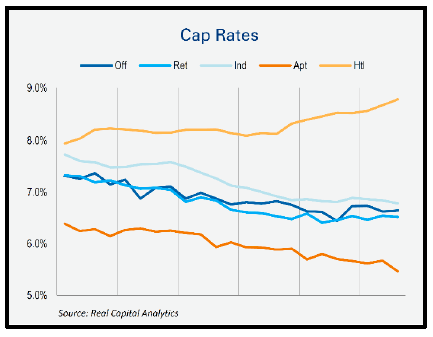 CAP rates have barely budged notwithstanding rising short term interest rates. Perhaps this is because rates at the long end of the US treasury curve, 10+ years, are almost exactly where they were one year ago. Although, as we have argued in the past, CAP rates and interest rates are less correlated that CAP rates and US unemployment.
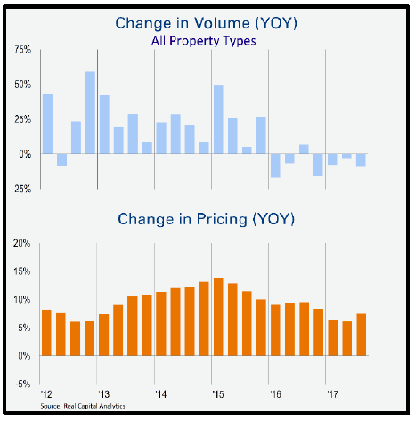 ng for several quarters now. The biggest change in the CRE capital markets is the acceleration of securitized loan origination, which is offsetting a declining rate of commercial mortgage loan growth at banks. Trepp the most prominent analytics firm tracking securitized commercial mortgages (CMBS) recently reported that issuance of CMBS has gained significant momentum after a slow start to 2017. In fact, our Q1 report conveyed expectations of about $70 billion in CMBS originations. Total issuance for the year is now expected to reach upwards of $85 billion— “and should easily surpass last year’s total which came during a time of global uncertainty and macro volatility”, according to Trepp. Approximately $26.8 billion in CMBS issuance was completed in Q3, making it the most active quarter for the CMBS industry in three years.
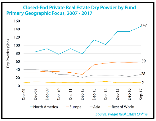 accumulate “dry powder.” Private equity real estate funds have $147 billion of committed capital focused on North America with myriad strategies ranging from relatively low risk debt funds to high octane opportunistic funds. Publically traded REITS are a bit quiet at the moment given that their shares are mostly trading at discounts to net asset value.
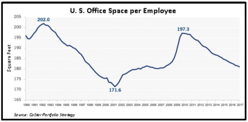 number, the less elbow room. Despite jumps that occur during recessions, when many companies cut staffing levels but retain their existing office leases, the long-term trend in square footage per worker is clearly down. Smaller computers, digitized legal libraries, less paper file retention and the entrance of the so-called “sharing generation” into the workforce have all made it easier for companies to fit more workers into less space.
 So herein we keep that promise. Readers may think after slogging through the following few pages that we are oblivious to all of the recent positive economic news. We are not. However, a deep rooted belief in the foundational philosophy of the Phillips Curve leads a majority of economic thinkers to conclude that all of the good news means inflation is just around the corner. What ensues below is an attempt for the time being to think more about the intermediate and longer term trajectory of inflation and interest rates and at least question that conclusion. After all, as we said above, rising short term interest rates don’t appear to be having much effect on CRE values, but changes in long term rates might!
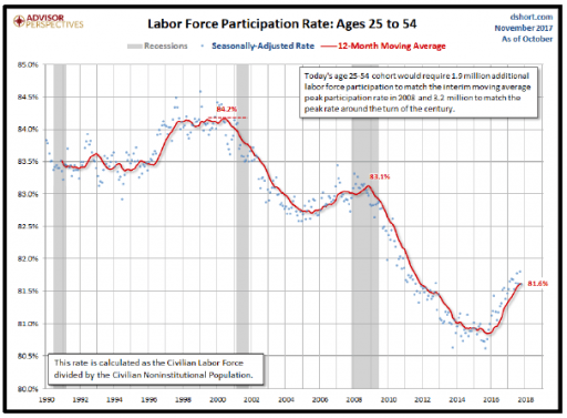 We would encourage readers to reread the previous sentence. In a nutshell, that belief is the core reason why many are currently predicting higher inflation and therefore higher long term interest rates in our near future, given the Federal Reserve’s almost decade long run now of extremely low interest rates and aggressive monetary base expansion.
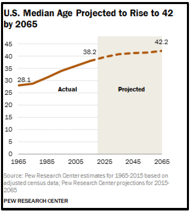 1950 and peaked at 67% in 2000, primarily due to more women entering the workforce, then declined steadily from there until appearing to stabilize in 2015 around 62.5%. While it is encouraging to see the prime age work force growing again, the overall rate remains well below its peak and the multi-cycle trend is clearly downward. Moreover, the broader participation rate for all workers is mostly unchanged since leveling off in 2015. The statistical background during the period in which the Phillips Curve theory was developed and evolved was one of either steady or rising labor force participation, quite different than current conditions. Second, the US was a more closed economy during that time. Global trade has expanded considerably since the later part of the last century, bringing tens of millions of units of labor outside the US labor market into the US inflation picture. Lastly, the age of the US population is rising. The median age in 1965 was 28.1 years, has risen to 38.2 years, and according to Pew Research is forecast to rise to 42.2 years by 2065. During the first part of the last century, the median age rose slightly, declined from 1950 through 1970 as a result of the baby boom, then began rising again at a faster pace as birth rates declined and life expectancies extended. This matters because consumption and spending patterns are different for different age groups.
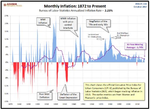 corpse and call the morgue. Another problem with giving up on the Phillips Curve as a foundational structure is that there are points in time where the data do show a measurable relationship, so economists presume the existence and look for other causes when the relationship breaks down. importantly, Phillips foundation is dead, then one conclusion is that central banks have very little influence on inflation. That would be disruptive indeed. A look at the nearby chart of inflation since 1872 shows that since 1900, all periods of significant inflation are associated with either war or major disruptions in the price of oil. Hmmm…?
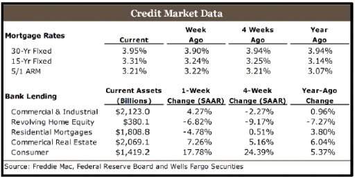 US expansion has been considerably less than the degree by which the Fed expanded bank reserves. In a fully leveraged, or over leveraged economy, loan demand is weak and the velocity of money is low, so central banks are unable to increase the money supply. The growth in bank lending in the US has slowed considerably in the past several quarters. Nearby is a chart we have displayed before which shows bank loan growth in all categories at 6% or below year-over-year, with C&I loans growing only 0.96%. At the end of 2015, C&I and CRE loans were both growing at 11% year-over-year. As if to drive home the point, look how little the mortgage rates have changed in the last year.
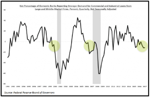 Senior Loan Officer Survey. The results of the recent survey are at the same level as they were at the start of the past two recessions making a case for a possible decline in economic activity in the intermediate term.